

You walk in. The walls are the same yellowing off-white they’ve been for five years. The washer hums. A single lightbulb does its best. And somehow, the whole room makes you feel like doing laundry is a punishment.
Here’s the thing nobody says out loud: your laundry room color ideas matter more than you think. You spend real time in there — sorting, folding, pre-treating that mystery stain on your kid’s soccer jersey. The color on those walls is either working for you or quietly draining you every single load.
These 11 ideas go well past the standard white-or-gray advice. Some are bold. Some are surprisingly soft. All of them are specific — exact paint names, finish types, what to pair them with, and where things go wrong. By the end, you’ll know exactly which direction to take your laundry room and why.
1. All-White Done Right (It’s Not What You Think)
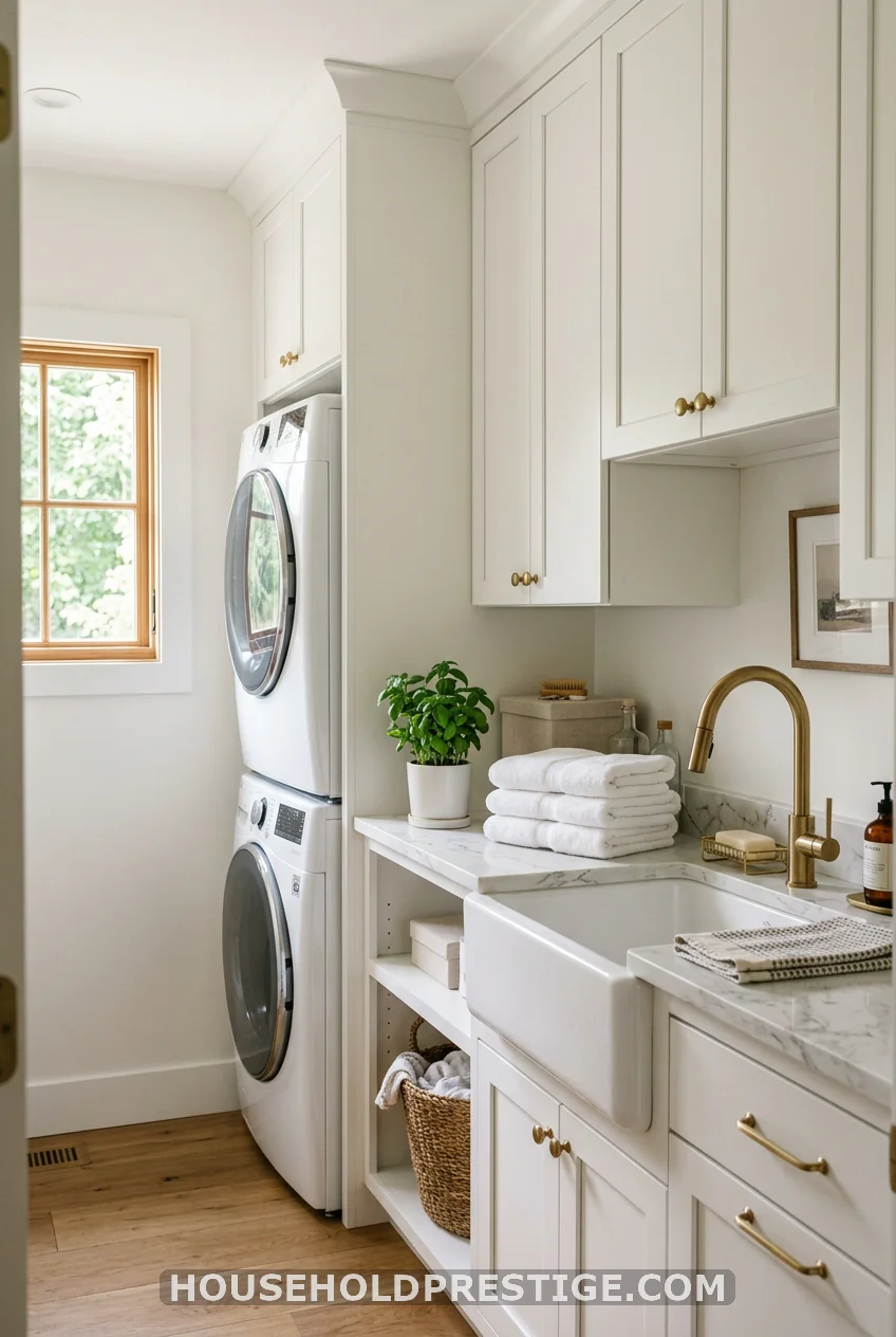
White is not the lazy option — unless you’re doing it wrong. Most people pick a white that’s either too stark (think hospital hallway) or too yellow (think old paperback). The difference between a white that feels luxe and one that feels neglected is exactly two things: undertone and finish.
For laundry rooms, Benjamin Moore Chantilly Lace OC-65 is as close to a flawless white as you’ll find. It reads clean without going icy, and it pairs with both cool stainless steel and warm wood accents without flinching. If your laundry room gets cool northern light, shift toward Sherwin-Williams Alabaster SW 7008 instead — it has the faintest warm yellow note that keeps things from reading clinical under artificial light.
The finish matters more than most articles tell you. Skip flat or matte for laundry rooms. The humidity and soap splatter will destroy a matte wall inside a year. Go satin (LRV 82+) on the walls and semi-gloss on the trim. Satin cleans up easily and still reads smoothly from across the room.
Where people get it wrong: choosing the same white as their trim. The walls and trim need to be different values of white to create any visual dimension. Try Chantilly Lace on the walls and a warm Atrium White on the trim. The subtle contrast makes both surfaces look intentional instead of accidental.
2. Dusty Sage Green
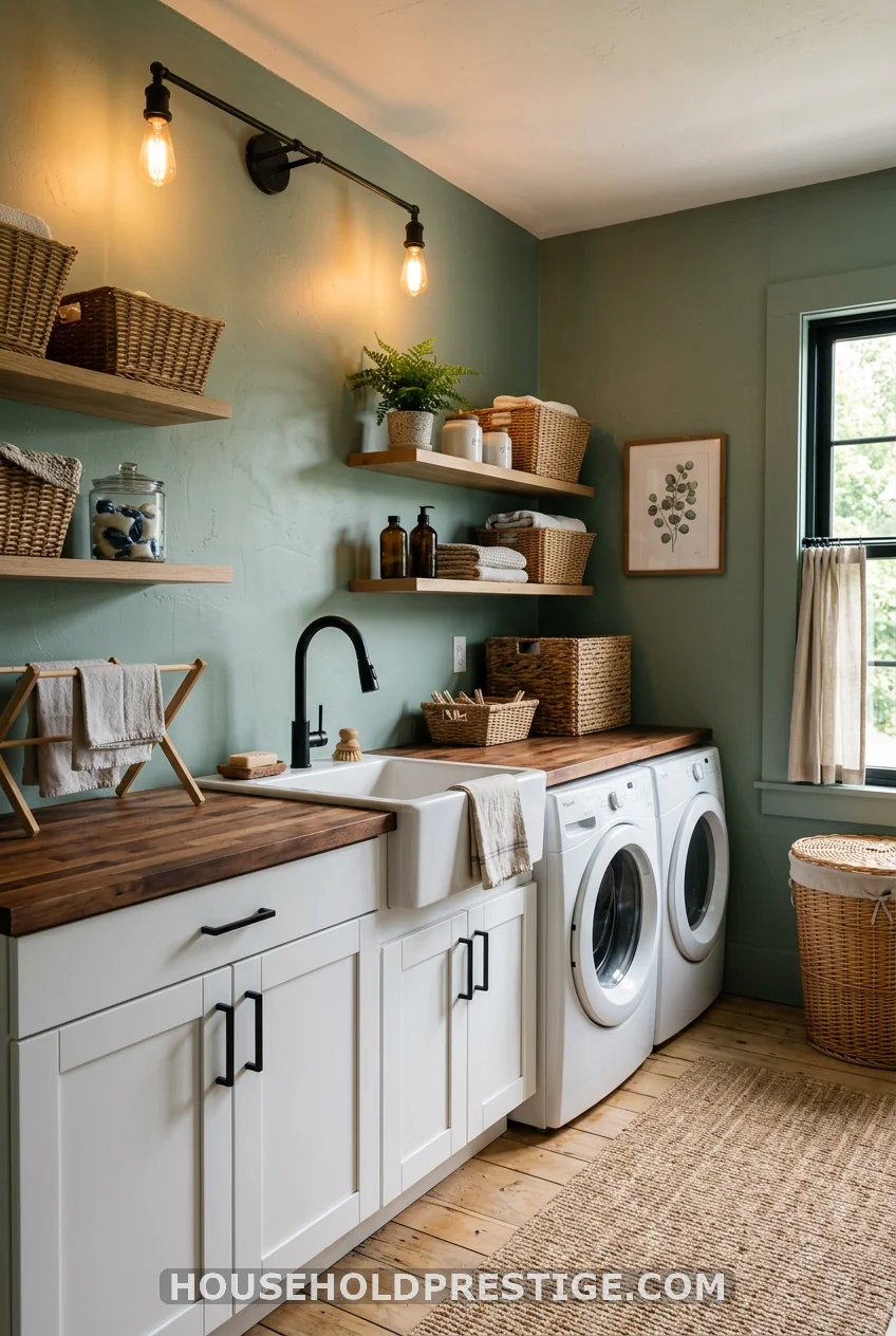
Sage green has moved from “trending” to “enduring” in the last few years, and laundry rooms are one of the best places to use it. The muted, gray-green quality of sage doesn’t compete with your appliances — it absorbs them. A white washer and dryer against sage walls looks intentional, not random.
Sherwin-Williams Rosemary SW 6187 is the one to know. LRV of 19 — definitely a mid-tone — so it needs good lighting to avoid reading dark. Pair it with warm brass hardware (not chrome) and natural wood shelving to keep the room from going cold. Benjamin Moore Saybrook Sage HC-114 is the lighter alternative at LRV 45, which works better in windowless laundry rooms where you’re relying entirely on overhead lighting.
The pairing that makes sage green look truly polished: white shaker uppers, natural butcher block (sealed thoroughly on all edges), and matte black hardware. The organic-industrial contrast is exactly why this color keeps performing on Pinterest.
One thing to watch: sage green with cool-white LED bulbs looks more gray than green. If you want the green to read true, use warm-white bulbs (2700K–3000K). Test the paint chip under both before you commit.
3. Warm Buttercream
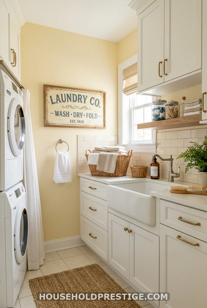
Buttercream yellow is the color that makes you feel like the sun is out, even at 6 AM when you’re loading darks. Benjamin Moore Pale Straw 2154-50 is barely-there yellow — more cream than color — and it reads warm without screaming “farmhouse kitchen.” It pairs beautifully with white appliances and doesn’t clash with stainless. A laundry room doesn’t need to be dramatic to be delightful. Sometimes warm and quiet is exactly enough.
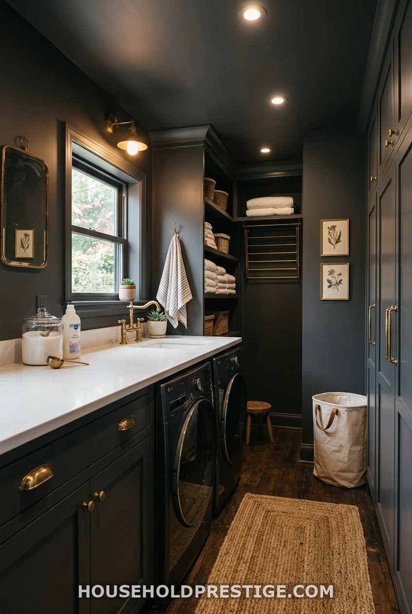
4. Classic Navy Blue: The Full Guide
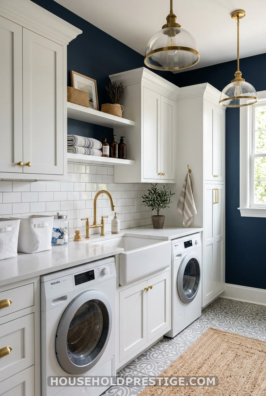
Navy is the laundry room color that surprised everyone. And it keeps surprising — it’s in the top-performing laundry room content across Pinterest year after year for a reason. Used right, navy makes a small laundry room feel like a jewel box instead of a closet with a drain.
Why It Works
Navy works in laundry rooms for the same reason it works in home offices: it creates a sense of enclosure and focus. A room you’re meant to do a task in benefits from a color that says, “we’re here to do something.” Navy draws the ceiling down slightly, which sounds counterintuitive, but in a room with no seating and no reason to linger, that cozy compression actually makes it feel more intentional.
The contrast with white appliances is also unbeatable. White against white disappears. White against navy pops — suddenly your machines look like a design choice instead of a default.
Choosing the Right Navy
Not all navies are created equal for laundry rooms. Here’s what you’re looking for: a navy with slight gray undertones, not purple or green.
- Benjamin Moore Hale Navy HC-154 — LRV 8.8. The most versatile navy on the market. It reads dark but not black, and its subtle gray undertone keeps it from going blue-purple under warm light. This is your safest choice.
- Sherwin-Williams Naval SW 6244 — LRV 4. This one is dramatic. If your laundry room has good lighting, it looks incredible. In a low-light room, it can absorb everything. Know your space.
- Benjamin Moore Van Deusen Blue HC-156 — LRV 14. Slightly lighter and more blue-true than Hale Navy. A solid option if you want navy without the depth of a near-black.
Do not use: Sherwin-Williams Indigo Batik (too purple under artificial light), or any navy with strong green undertones (they read murky near white machines).
The Finish Question
Navy requires a satin finish minimum. Here’s why: dark colors absorb light, and a flat finish on a dark wall looks chalky within months — especially with the humidity fluctuation in a laundry room. Satin reflects just enough light to keep the color looking rich. Semi-gloss on the trim only — not on the walls, or it will look painted by a preschooler.
Pro tip: Prime with a gray-tinted primer before applying navy. Two coats of dark paint over white primer = uneven coverage and visible streaks. One coat over gray primer + one finish coat = smooth, deep coverage.
Step-by-Step: Painting a Laundry Room Navy
- Clear the room entirely. Pull the washer and dryer out from the wall. You cannot edge properly around appliances.
- Wipe walls with a damp cloth and mild TSP substitute (available at any hardware store, ~$8). Remove dust, lint residue, and any grease from detergent splatter. Let dry 30 minutes.
- Fill any holes or dents with lightweight spackling compound (e.g., DAP DryDex ~$7). Sand smooth when dry.
- Apply painter’s tape to baseboards, ceiling edge, window trim, and outlet covers. Press tape edges firmly with a putty knife to prevent bleed.
- Prime with a gray-tinted primer. Sherwin-Williams Multi-Purpose Latex Primer tinted 50% toward your navy color works perfectly (~$45/gallon). Roll walls, brush edges. Let dry 4 hours.
- Cut in with a brush first (2–3 inches from all edges) before rolling the field. Use a good angled brush (Purdy XL Glide 2.5″ ~$18) — a cheap brush will leave marks in dark color.
- Roll the walls in “W” patterns to prevent banding. Maintain a wet edge throughout. Two coats minimum; navy typically needs three for uniform coverage. Let each coat dry 4–6 hours.
- Remove tape while paint is still slightly tacky (not fully dry). Pulling tape from fully dry dark paint often chips the edge.
Materials & Costs
| Item | Recommendation | Approx. Cost |
|---|---|---|
| Primer | SW Multi-Purpose Latex (gray-tinted) | $40–50/gallon |
| Paint | BM Hale Navy HC-154 (satin) | $60–75/gallon |
| Angled brush | Purdy XL Glide 2.5″ | $16–20 |
| Roller cover | 3/8″ nap for smooth walls | $6–10 |
| Painter’s tape | ScotchBlue 2090 1.5″ | $8–12 |
| TSP substitute | DAP or Krud Kutter | $7–10 |
| Spackling | DAP DryDex | $6–8 |
| Total | ~$145–185 |
A standard laundry room (8×8 ft, two coats, primer included) typically uses 1.5 gallons of paint and 1 gallon of primer.
Common Mistakes to Avoid
Mistake 1: Painting the ceiling white over navy walls. It creates a stark, jarring line that makes the room feel unfinished. Option A: paint the ceiling the same navy (feels intentional, dramatic). Option B: use a mid-blue 30% lighter than your wall color — it blends beautifully.
Mistake 2: Using cool-white LED lighting. At 5000K, cool white makes navy walls look greenish-gray. Use 2700K–3000K bulbs. If you have recessed lights, a $12 bulb swap completely changes the feel.
Mistake 3: Matching navy walls with dark hardware. The room needs a light-reflective accent to keep it from going cave-dark. White, brass, or soft gold hardware is the move. Matte black on navy walls is a Pinterest illusion that looks great in a photo and absorbs all available light in a real 60-square-foot room.
Mistake 4: Not ordering enough paint. Dark colors require 3 coats on most walls. Buy an extra quart. Running out mid-coat and adding a fresh can mid-wall causes sheen variation you’ll see every time you do laundry.
5. Soft Dusty Pink
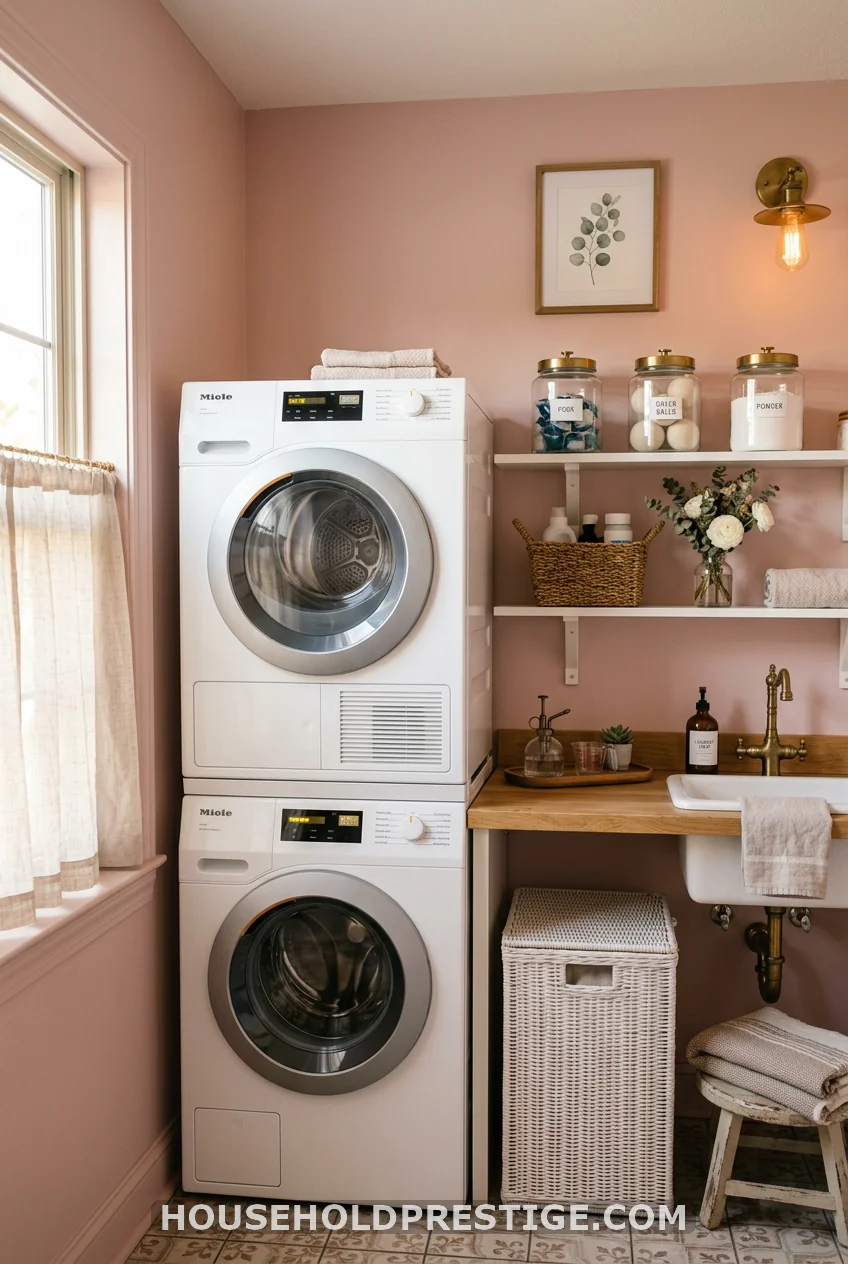
This one converts skeptics fast. Not candy pink — Farrow & Ball Dead Salmon No. 28 or Benjamin Moore Mellow Rose 2174-40, both of which lean almost like a warm blush-nude in person. Against white machines and white cabinetry, it reads feminine without being childish. In a small laundry room where bold navy feels like too much commitment, dusty pink hits the sweet spot between personality and livability.
6. Terracotta and Earthy Warm Orange
IMAGE_PLACEER_121
Terracotta in a laundry room is a bold choice that almost nobody regrets. The warm orange-brown tones make the whole room feel grounded, cozy, and somehow — less like a chore. There’s a reason pottery studios and cafés use this color: it makes you want to stay longer.
Benjamin Moore Tangerine Dream 2014-30 is a full terracotta that needs real light to avoid reading too orange. In a well-lit laundry room it is stunning. Sherwin-Williams Cavern Clay SW 7701 — Sherwin’s 2019 Color of the Year — is more muted, sitting between clay and rust, and works in lower-light spaces better.
The key pairing rule: terracotta needs cream, not white. True bright white next to terracotta creates too much contrast and makes both colors look wrong. Off-white cabinets (think Benjamin Moore White Dove OC-17) and warm-toned hardware (unlacquered brass or oil-rubbed bronze) keep the room harmonious.
What to avoid: terracotta with cool gray tile floors. The warm-cool clash reads chaotic. Stick with warm beige, cream, or terracotta-toned tile. If your current floor is cool gray and you can’t change it, stick to a lighter clay color instead.
7. French Blue: The Cautionary Tale
I want to tell you about the time I picked the most gorgeous blue on the paint chip and ended up with a purple laundry room.
The color was called something like “Morning Haze.” It looked exactly like a soft, breezy French blue on the sample at the paint store — that cornflower, country-kitchen blue that photographs beautifully and screams European farmhouse laundry room. I painted the whole room. I stood back. The walls were unambiguously lavender.
Here’s what happened: the overhead light in my laundry room runs cool (it was a standard 4000K LED bulb), and cool light combined with the blue’s existing violet undertone pushed the whole wall into purple territory. Two gallons of paint and a full Sunday gone.
What actually works for French blue in a laundry room:
First, check the undertone. You want a blue with slight green or warm gray undertones — not violet. Sherwin-Williams Resolute Blue SW 6507 and Benjamin Moore Normandy 2129-40 both read true blue under a range of lighting conditions without sliding purple.
Second, test under your actual laundry room lighting — not the living room window. Paint a 12×12-inch sample card, tape it to your laundry room wall, and look at it under the overhead light at night. If it shifts even a little toward purple, move to a warmer blue.
Third, pair French blue with natural warm wood tones to anchor it. White walls everywhere plus French blue can read cold. Wood shelving or a butcher block countertop pulls the warmth back in.
8. Deep Forest Green (What Most People Get Wrong)
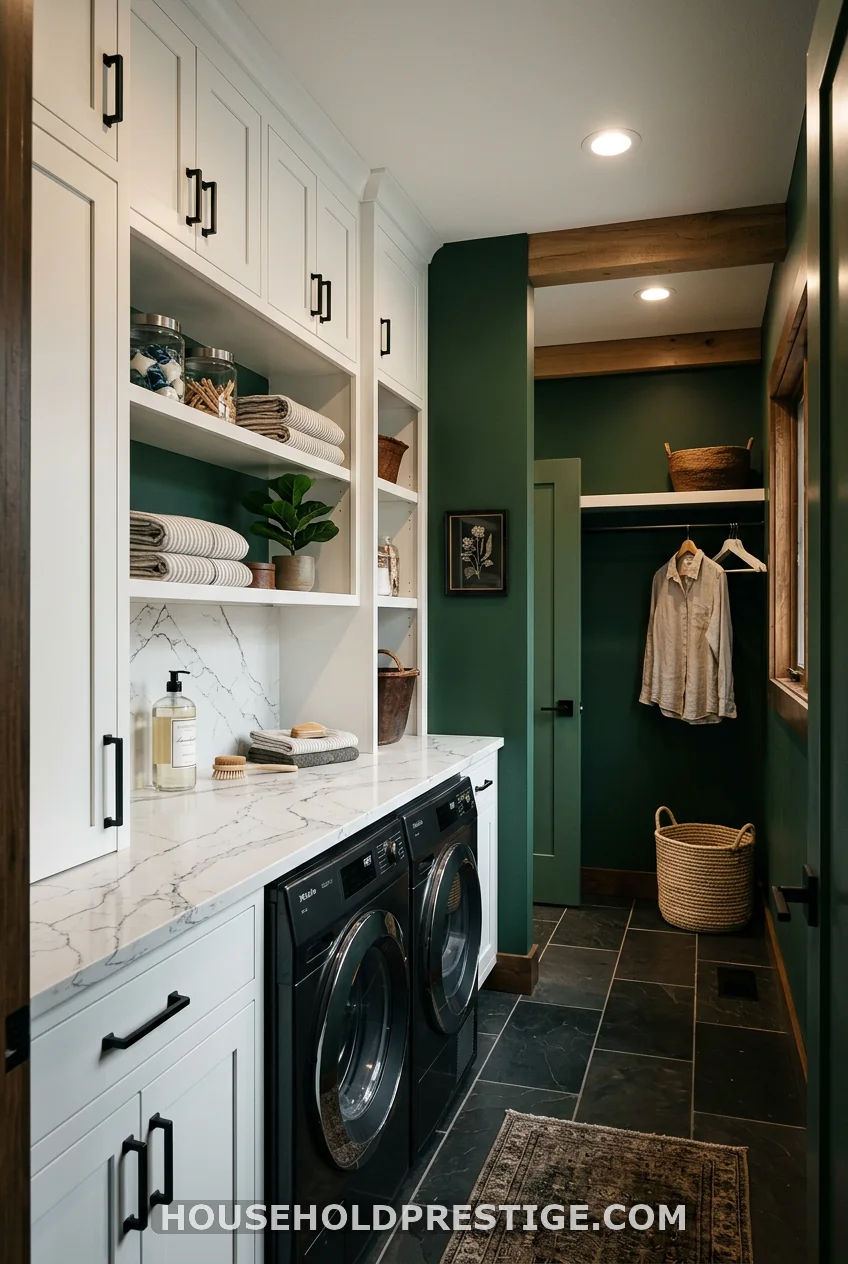
The myth: dark colors make small rooms feel smaller. The reality: they make small rooms feel deliberate. There’s a significant difference.
Most people believe that painting a 6×8 laundry room forest green is a mistake. They’re imagining their existing cramped white room, just darker — which does sound worse. But that’s not how dark color works. Deep, saturated color removes the hard awareness of the room’s boundaries. You stop mentally measuring the walls.
What most people think: Forest green = dark = oppressive in a small space.
The reality: In a laundry room with decent lighting and white cabinetry, forest green creates depth — not claustrophobia. The cabinetry stays visually forward. The walls recede. You get a layered, designer-looking space instead of a beige box with appliances.
Sherwin-Williams Hunt Club SW 6468 (LRV 8) is a rich forest green with brown undertones that keep it from reading cold. Benjamin Moore Salamander 2050-10 goes even deeper and has slight blue undertones — extraordinary with brass hardware and white marble.
The non-negotiables for dark green to work:
– Minimum two light sources (overhead + under-cabinet or a plug-in sconce)
– White or cream cabinetry — essential, not optional
– Warm-toned accessories (wicker, wood, linen)
– Semi-gloss trim in a clean white to create contrast
Skip dark green if your laundry room has zero natural light and no way to add task lighting. The color needs something to reflect.
9. Warm Greige
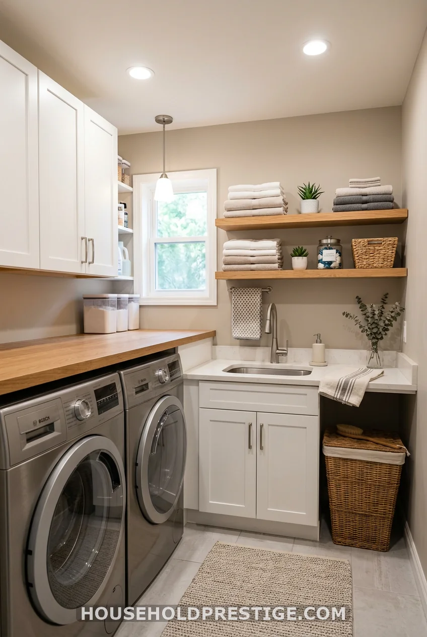
Greige is the Switzerland of paint colors. It offends nobody and pleases everybody. Sherwin-Williams Accessible Beige SW 7036 is the standard-bearer — warm enough to avoid cold-gray syndrome, neutral enough to coordinate with everything from chrome to brass to matte black. If you’ve got a connected hallway in a different color, greige is the transition color that makes them both look better. It costs nothing in effort and delivers everything in cohesion.
10. Charcoal Gray with Color Drenching
Color drenching — painting walls, ceiling, trim, and cabinets all the same color — sounds extreme until you see it done well. In a laundry room, it’s one of the fastest ways to make a plain, boxy space look like it was actually designed.
Benjamin Moore Iron Mountain 2134-30 is the charcoal gray that works best for color drenching. LRV 12 — dark but not black — with no obvious cool or warm lean, which means it doesn’t fight with your appliances. Paint everything literally: walls, ceiling, baseboards, cabinets. Use the same color in eggshell on the walls and semi-gloss on the cabinets for a slight tonal difference without losing the cohesion.
The hardware rule for color-drenched charcoal: go warm gold or unlacquered brass. Chrome disappears. Black disappears harder. Warm metal is the only accent that registers visually against a dark-drenched room.
One caveat: color drenching requires your lighting to step up. One overhead fixture at 60 watts in a drenched charcoal room is not enough. Add under-cabinet LED strips ($15–25 for 10 feet) — they make the counter surface glow against the dark walls and add functional task lighting at the same time.
11. Two-Tone: Bold Cabinets + White Walls
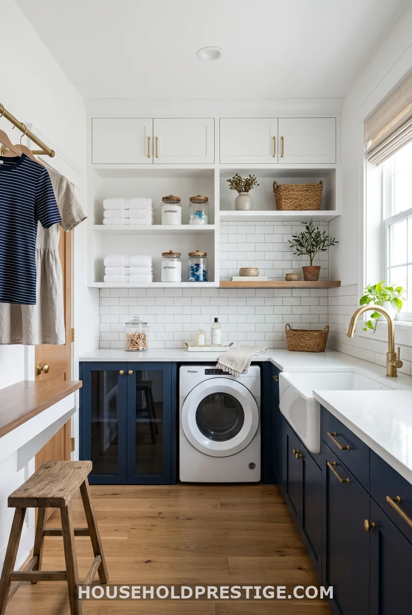
This approach sidesteps the “what if I hate it?” paralysis entirely. You keep your walls white — safe, resellable, bright — and put all the color on the cabinetry. The result is a high-contrast, designed-looking room at a fraction of the commitment.
The formula: white upper cabinets + bold lower cabinets + white or light walls. The uppers stay light and open. The lowers get color. The visual weight stays at floor level, which actually makes the room feel taller.
Best bold colors for lower cabinets:
– Navy: Benjamin Moore Hale Navy HC-154 — classic, always looks expensive
– Forest Green: Sherwin-Williams Jasper SW 6216 — earthy and fresh
– Deep Terracotta: Benjamin Moore Moroccan Spice 2171-20 — warm and unexpected
– Slate Blue: Sherwin-Williams Still Water SW 6228 — soft and sophisticated
Use a semi-gloss finish on all painted cabinets — it’s more durable than satin for surfaces that get touched and wiped down constantly, and easier to clean without wearing the color away.
The hardware rule: pick one metal finish and use it everywhere. Switching between gold and chrome in the same room, even intentionally, reads inconsistently in a small space. Pick brass, matte black, or nickel — and commit.
Putting It Together: How to Pick the Right Color for Your Space
There’s a hierarchy to this decision, and most articles skip it entirely.
Step 1: Assess your lighting. A windowless room with cool LED lighting will shift any blue toward purple, any gray toward lavender, and any green toward gray. Swap to 2700K bulbs before you even test paint chips.
Step 2: Note your appliance color. White appliances look best against dark or warm colors — the contrast does the work. Stainless steel is forgiving with almost everything. Graphite/black appliances look best against mid-tone colors.
Step 3: Consider your adjacent rooms. Your laundry room doesn’t need to match your hallway, but it shouldn’t fight it either. If your hall is a warm beige, a cold-blue laundry room will feel like a wrong turn.
Step 4: Test on the wall. Always. Every time. A paint chip in a hardware store is backlit by fluorescent light. Your laundry room is not. Order a Samplize peel-and-stick sample ($8–10 per color), put it on your actual wall, and look at it from Monday through Friday under different light conditions before you buy a gallon.
Conclusion
Your laundry room doesn’t have to earn the right to be a real room. It already is one — you just haven’t told the walls yet. Whether you go all-white-done-right, color-drenched charcoal, or bold two-tone cabinets, the key is specificity. Pick an actual paint name, test it under your actual light, and commit.
One gallon. One afternoon. That’s genuinely all it takes to change the whole feeling of a room you use every single week.
Frequently Asked Questions
What is the best color for a laundry room with no windows?
Warm neutrals like Sherwin-Williams Accessible Beige or Benjamin Moore White Dove tend to perform best in windowless laundry rooms because they reflect whatever artificial light is present without looking cold or clinical. Avoid cool blues and grays — without natural light to correct them, they’ll shift toward lavender or greenish-gray under most overhead bulbs. If you want color, go warm: buttercream, sage (with warm-toned bulbs), or terracotta.
Should laundry room walls be painted in a satin or eggshell finish?
Satin is the standard recommendation for laundry rooms because it handles humidity better than eggshell and wipes down more easily. Flat and matte finishes absorb moisture and stain quickly in environments with detergent splash and steam. Eggshell is an acceptable second choice if your laundry room is well-ventilated, but satin gives you more longevity without looking glossy.
Does dark paint make a small laundry room feel even smaller?
Not necessarily. Dark colors used intentionally — especially with good lighting and white cabinetry — can make a small laundry room feel like a designed space rather than a utility closet. The key is contrast: dark walls need light-colored surfaces (white appliances, white cabinetry, light countertops) and adequate lighting to work. A dark room with dark cabinets and a single lightbulb will feel small. A dark room with white cabinetry, recessed lighting, and brass hardware looks intentional and layered.
What paint color makes a laundry room feel cleaner?
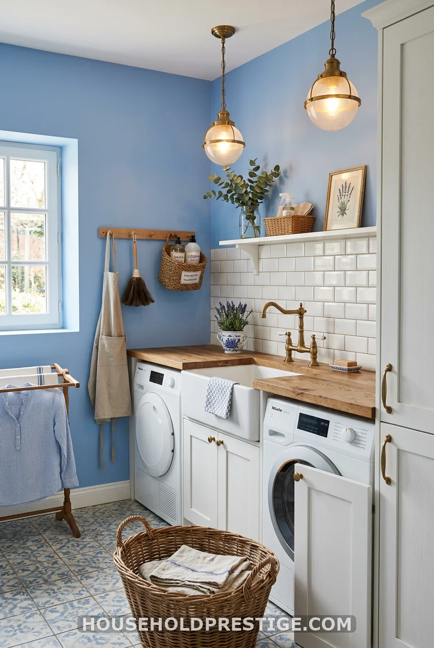
Crisp whites (Benjamin Moore Chantilly Lace, Sherwin-Williams Extra White) and soft blue-grays (Benjamin Moore Solitude AF-545, Sherwin-Williams Repose Gray) both read as clean and fresh because we associate those tones with laundered fabric. Light blue especially benefits from this psychological association — it’s the color of clear sky and clean water, which makes it a natural fit for a space dedicated to cleaning.
Can I use the same paint color in my laundry room and hallway?
Yes, and it often looks better than using a completely different color. Using the same color creates visual flow, making both spaces feel larger and more connected. If you want a distinction, use the same color family but a slightly different shade — one step lighter in the hallway and one step deeper in the laundry room, for example. Avoid jarring contrast at doorways; the transition should feel intentional.